CareerFirst website for INTO University Partnerships
Website design for new product in the INTO portfolio - courses for international students to enhance their career prospects upon graduation.
Year
2022
Client
INTO University Partnerships
Project overview
This project focused on designing a mobile-first website for INTO CareerFirst — a new program aimed at preparing international students for career success. The business goals were to effectively communicate the program’s benefits and to drive the enrolment for its first cohort of students.
My role involved establishing a clear, user-centered information architecture and navigation, using user research to inform a content strategy that resonated with prospective students.
My Role
As the UX lead on this project, I was responsible for:
conducting competitor research
compiling user flows
designing the structure and IA of the site
creating wireframes of the page designs
creating a basic prototype of the website for testing
planning and conducting user research
writing and presenting the user testing report and feedback
collaborating with other designers and stakeholders on the final UI design
supporting implementation of the new website
Tools used
Figma, Lookback, Miro, FigJam, Slack, MS Office.
Design snapshots

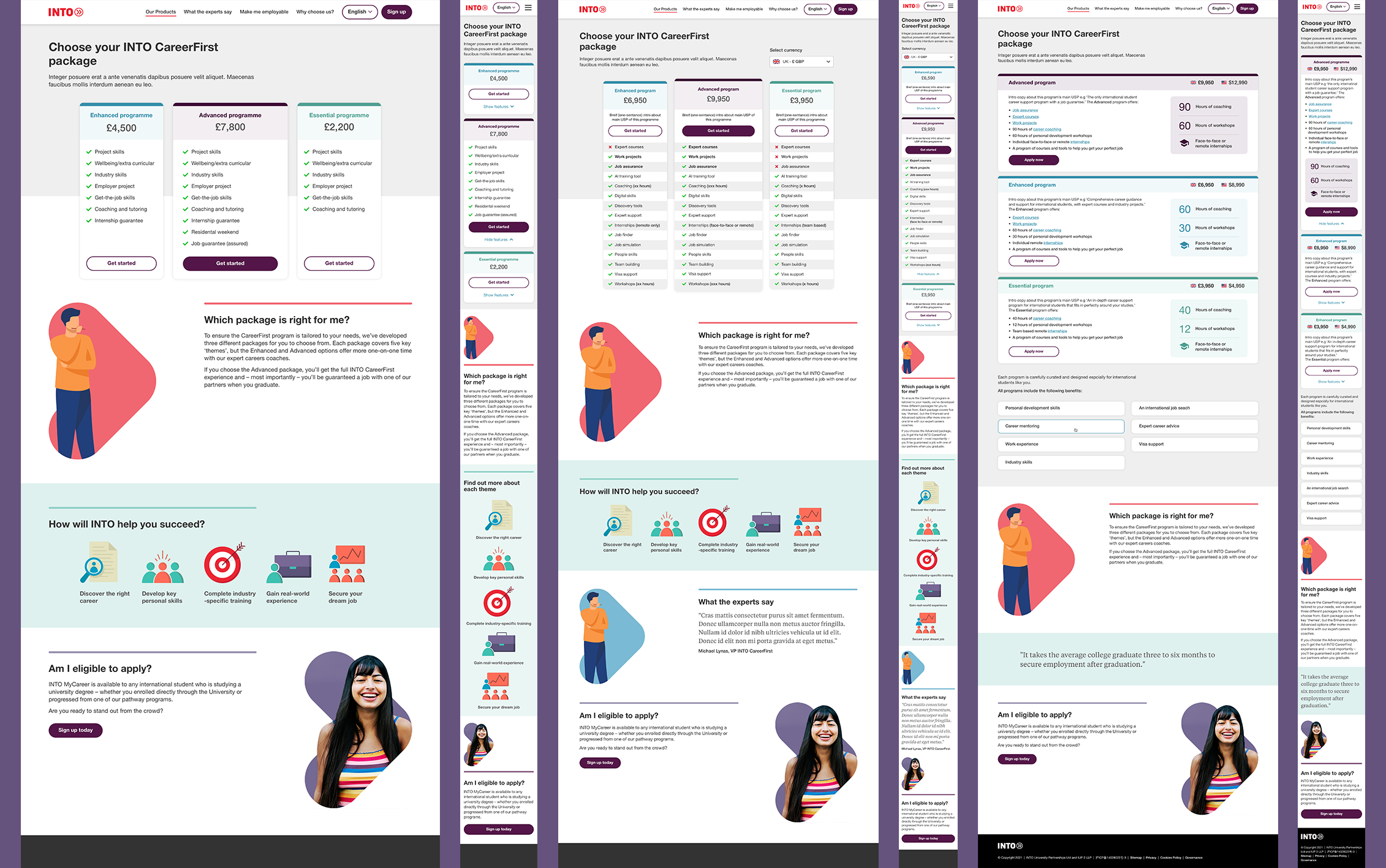
High-fidelity wireframes showing the new website design on a desktop computer.
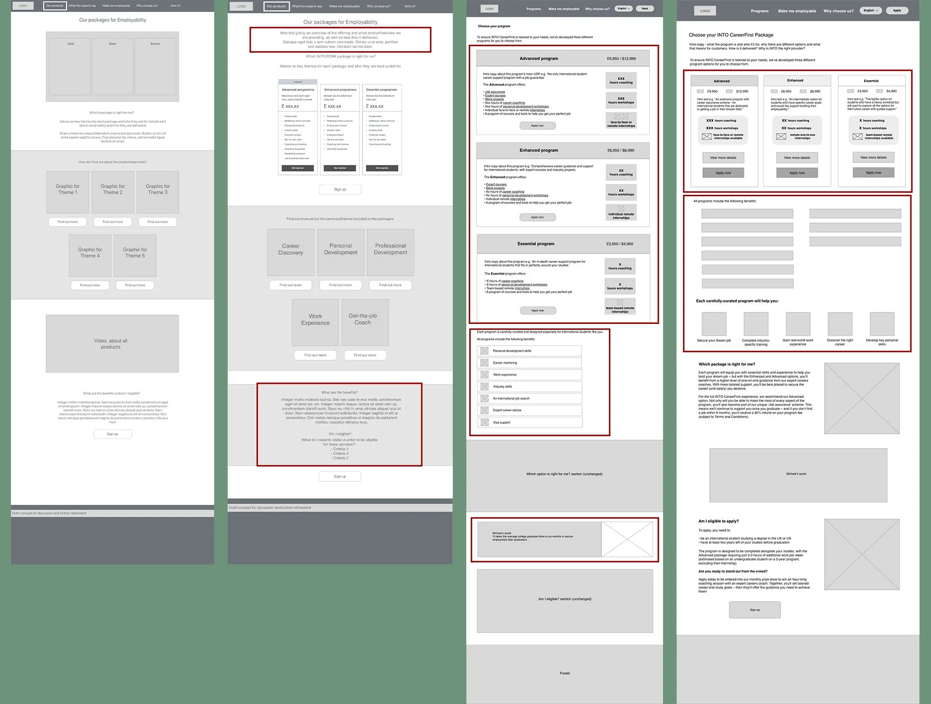
Low-fi wireframes of the new website pages

A low-fi wireframe showing one of the iterations of the price comparison table.
Challenges
Undefined products
The proposition hadn’t been fully fleshed out when we started working on the website. Details such as product names, prices, structure, timings and options were all still being decided on as we designed the website, and changed constantly throughout the project.
Time constraints
Very little time was allocated in the project for user research and iterations on the original prototype after testing.
External agency use
Another design agency was working in parallel on the visual branding. Unfortunately as a print-first agency with little experience of digital design, the assets and ideas they produced were unsuitable for a mobile-first website and had to be changed significantly.
Communication
Due to a lack of direct communication from the agency to our in-house design team, there were delays with the sign-off of visual elements, which caused additional pressure on team in order to meet the launch deadline.
Generic content
As this was a new product to the business, we had no previous students to draw social proof content from. Academics, partnered companies and institutions also hadn’t been confirmed, so the content ended up being quite generic and vague.
Covid-19 restrictions
Ongoing Covid-19 restrictions and absences attributed to a higher level of no-shows and meant we needed to conduct our usability tests remotely rather than in-person.
Research process
Before the project started, a piece of work had been done by another agency to validate the demand for the product. Although this gave us some insights into user concerns and priorities for their future careers, we still needed to uncover user needs and questions to inform our content development. We also needed to:
check the flow and structure of the proposed website design
check the language was appropriate for an international audience
gauge the level of comprehension of the proposition
We decided the best way to accomplish this was through a combination of usability testing and user interviews. Unfortunately due to project time constraints, our research took place after the soft launch of the website.
-
Due to ongoing Covid-19 restrictions and the international locations of our target audience, we conducted our usability testing and interviews remotely.
As there was a short turnaround time required, we used a panel of pre-screened research participants, who were all current international students studying at an INTO centre in the UK or US.
Our test script included some interview questions at the beginning to gain some insights into user goals and how they currently accessed careers support.
I then gave tasks for each page of the prototype that mimicked the predicted user journey, but allowed participants the freedom to explore areas that caught their attention.
This approach meant we could sense-check the flow of information, uncover issues with the design and gather insights into which areas of content were most attractive to our audience.
-
Most users understood that INTO Careerfirst was an INTO service from the name but the actual product being sold was unclear from the homepage.
Users wanted to explore the ‘Programs’ page first and then wanted more detailed information around what they would be studying before they considered applying. Unfortunately the Programs page lacked any contextual information, so users were initially confused.
Having a comparison across program options was useful. Users wanted much more detail on each of the services but appreciated the lists with ticks and crosses for a quick overview.
We observed some indication of what program and elements provided interest or caught their eye.
Talking to someone or seeing real feedback from students was very important to them. Some students felt they would need this before they would purchase the course.
-
After feeding the testing results back to the stakeholders, we prioritised a redesign of the homepage and the programs page, as these were the areas that caused the most confusion and were key touch points for every user journey.
The ideal next step would have been to run an ideation workshop or sketch session with teams at this point. Unfortunately due to such a tight project timeline, there wasn’t any time allocated this.
So instead we gathered all our feedback from user testing and research, the stakeholder group, and the sales and marketing team. Then, working together with two other members of the design team, we workshopped some possible solutions and iterations on the original website using parallel design.
Solutions
Understanding what we were trying to convey on the website was the biggest challenge here. The products were complex but with little concrete detail, and the business decisions were still ongoing. So the first thing we did was to come up with a 'strawman' website using low-fidelity wireframes.
The pricing comparison table
We invited feedback from the stakeholder group and other members of the design team. I consolidated this feedback and also conducted a bit of competitor analysis to see how similar complex products presented themselves. This helped to shape a version 2 low-fidelity wireframe, the main changes at this point were:
the addition of introduction text above the comparison table, as it felt a bit jarring to be suddenly met with a table of pricing information.
separating out the benefits from the eligibility criteria, so that this information was clearer and easier to identify.
Addressing stakeholder concerns
Post-launch, there was some stakeholder discussion and concern around the comparison table. Particularly:
would users understand the key differences in the programs?
how could we display prices in a way that didn't scare off prospective students?
how could we accommodate a growing list of services without making the table incredibly long?
According to the stakeholders, the high price of the packages appeared to be the biggest obstacle to enrolment. This prompted a couple of revisions were we toyed with different ways of displaying prices, including using local currency conversion and a 'price per year' model.
As the mobile design used cards with drop down accordions, I also prepared an alternative layout for the desktop version of the programs page, which mirrored the mobile version. We tested this wireframe in several of our user testing sessions to get feedback.
User feedback on the designs
Users liked that the differences in the packages were clearly highlighted, but felt that it was much harder to compare because they had to scroll up and down.
This prompted a return to the comparison table design with another revision that combined the two ideas, and used subpages to provide further detail about each of the packages for users who wanted more information.
Outcome
Following our initial round of user research and the iterations on our design, I recommended that we do a a second round of testing using the new wireframes. I wanted to ensure that we had found a satisfactory solution to the problems we uncovered during the first tests.
Unfortunately with no budget or time allocated for additional research, we were unable to pursue this.
After reviewing our research, the key stakeholders decided that the INTO CareerFirst proposition required further clarification and simplification before they could effectively sell it online.
The company announced that they needed to take a step back and work on the products themselves before the next iteration of website could be made.
After several months, they launched the website under a different brand name, selling two simpler products instead.
As a direct result of our work, the product design team saved INTO a great deal of money and time by highlighting the areas of this new venture they needed to work on before taking the products to market.